What to consider when selecting fonts.
Brand fonts
Brand design
Font licensing
Font legibility
Fonts are a crucial part of effective communication, no matter platform or medium. Ideally, your choice of typeface makes a clear statement about your brand’s identity and helps you connect with your audience. The right fonts are also unobtrusive and easy to scan, maximizing readers’ ability to comprehend your message, while poor font choices can actively hinder comprehension.
As you embark on a project from scratch, the process of finding the perfect font can become overwhelming, leading to an endless cycle of searching, browsing, and testing. To help you avoid this frustrating typographic trap, here are some useful tips for choosing the ideal font for any project.
Where should I buy fonts for commercial use?
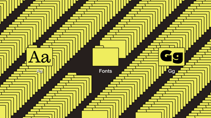
Rather than buying individual fonts—and attempting to keep track of each of their licenses over time and throughout your agency—you can streamline your typographic process by investing in a font subscription that includes a font manager, which centralizes all your fonts in one unified library.
Monotype Fonts is the premier all-in-one cloud-based font manager. With a Monotype Fonts subscription, you and your creative team gain instant access to more than 150,000 professional-grade fonts from the Monotype library and their foundry partners, plus built-in organization for your existing font collection.
Choose from a range of Monotype Fonts subscriptions for individuals, teams, and large enterprises to customize your plan for your commercial needs. Access every font type imaginable—and breathe easy knowing there’s no risk of that dreaded “missing fonts” error.
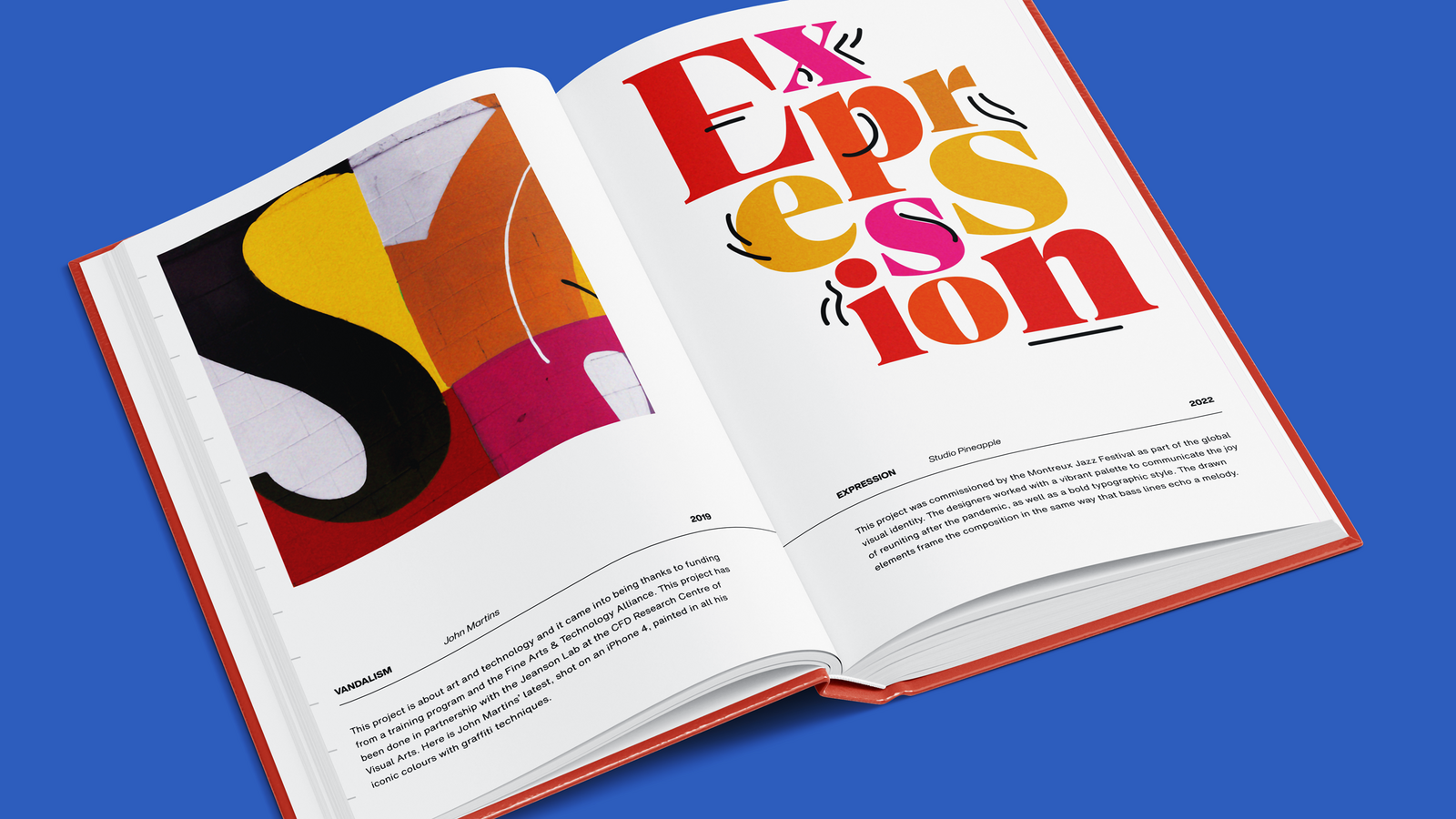
As a rule, serif and sans serif fonts have different associations: the design flourishes and varied strokes of serifs are playful, charming, and warm, while the hard, perfect lines of geometric sans serifs evoke modernity and innovation. This means that, for instance, using a quirky serif for a webpage or infographic that’s meant to project gravitas and authority can powerfully undermine your message. Consistently getting the mood right helps you establish a strong brand identity that sets you apart from the competition.
Font type.

Choose functional font families.
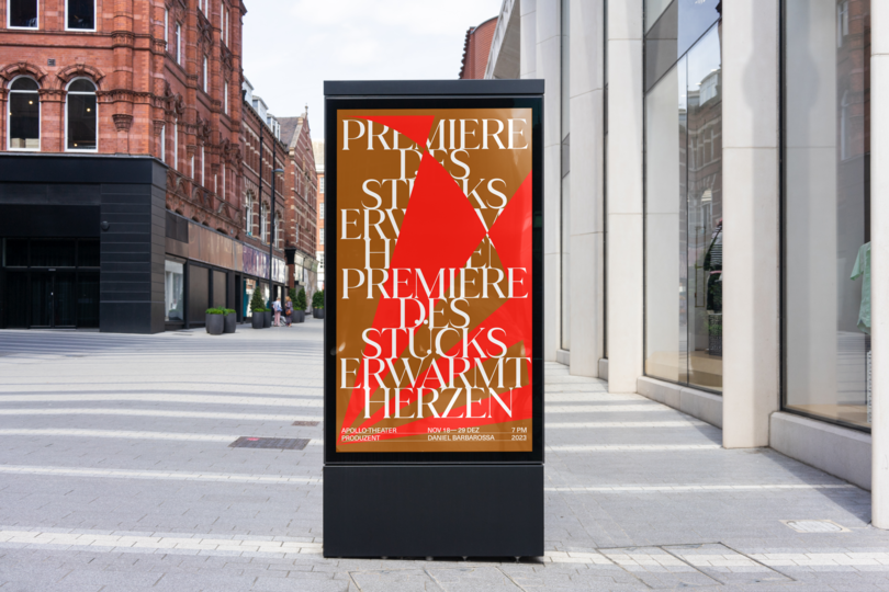
Especially when choosing brand fonts, make sure you’re selecting font families that support a wide range of font sizes, styles, and weights. This provides you with the options you’ll need to create distinctive assets across a variety of use cases.
It’s also important to understand your market and anticipate where in the world your assets and designs will be viewed. This will help you hone in on font families that have adequate language support, including support for any special characters you may need to use.
Test extensively.
Once you’ve come up with a short list, test font options in real-life scenarios to observe how they perform. Imagine presenting a design proposal to your clients or teammates. Can you confidently explain how each font choice meets the project goals?

Where should I buy fonts for commercial use?
Rather than buying individual fonts—and attempting to keep track of each of their licenses over time and throughout your agency—you can streamline your typographic process by investing in a font subscription that includes a font manager, which centralizes all your fonts in one unified library.
Monotype Fonts is the premier all-in-one cloud-based font manager. With a Monotype Fonts subscription, you and your creative team gain instant access to more than 150,000 professional-grade fonts from the Monotype library and their foundry partners, plus built-in organization for your existing font collection.
Choose from a range of Monotype Fonts subscriptions for individuals, teams, and large enterprises to customize your plan for your commercial needs. Access every font type imaginable—and breathe easy knowing there’s no risk of that dreaded “missing fonts” error.
