Play by Instinct: Jess Goldsmith’s favorite playful fonts.
Foundry collection
Typography
Type design
What happens when we leave behind traditional constructs and expectations, and instead embrace play and exploration?
Through three collaborations with multi-disciplinary creatives, we’re exploring just that — what happens when we create for the sake of creating, and the ways creativity and intuition can transform typography into a playful and multi-sensory experience.
Our collaborator for this part of the series is Jess Goldsmith, founder of Women of Type, and an illustrator and lettering artist from Brooklyn, New York. Read on for her favorite playful font selections from Monotype Fonts, in her own words.
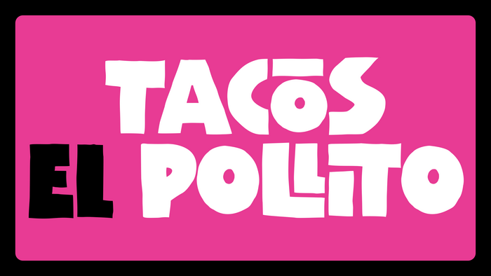
Cultures Carnival Regular
This font is so fun and blocky. It feels organic without being too rough or juvenile. To me, it feels like it belongs on retro packaging that was originally hand-drawn and meant for a kitchen appliance brand.
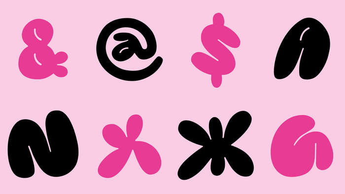
SK Pupok
This font is like if the ‘90s graffiti vibe was more fine-tuned.
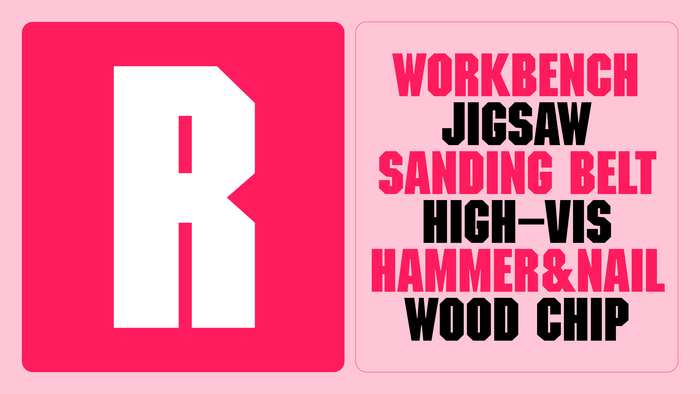
ITC Machine
I love this one simply because I can imagine all of the fun effects, shadows, and textures that I could add inside of it.
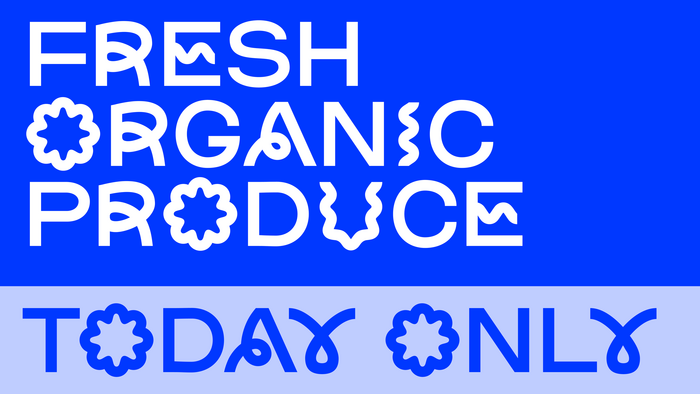
Comba
I don’t know how a font could get more playful than this! Comba is like the hype of Jokerman in the early 2000s without the future regret of using it in projects.
Lemon Squish Italic
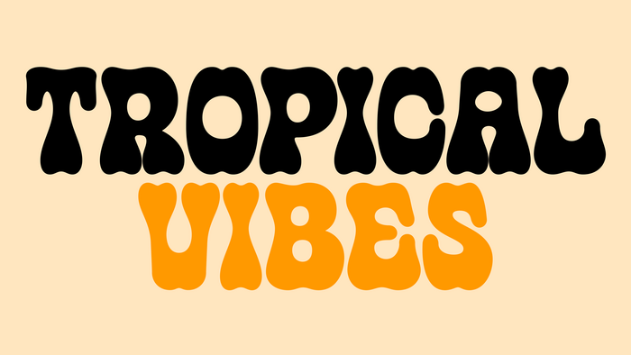
First of all, amazing name for a font. No notes. So funky, chunky, and western –what a good time! This feels like a summer party to me.
Deicide Remain
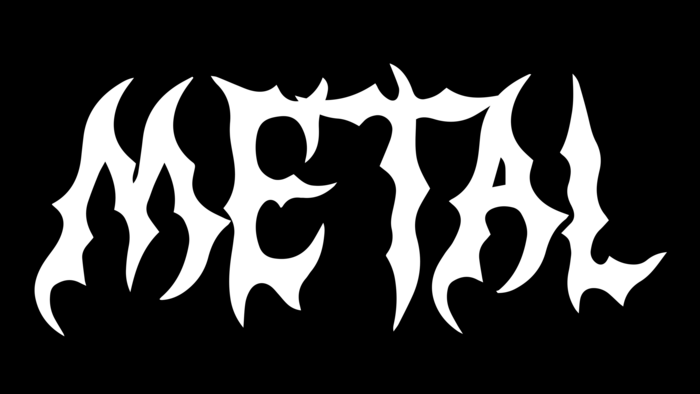
Omg this is FUN. It’s fun because it’s pretty metal and a little bit spooky, but it makes me want to create something cute with it for a funny juxtaposition.
Music Nouveau JNL
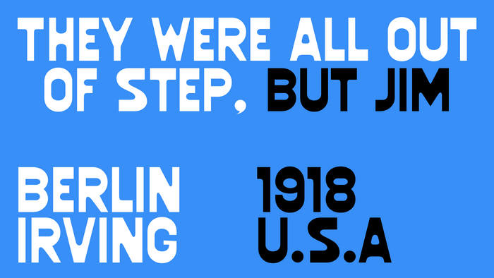
I love the curves in this font juxtaposed with the sharp edges.
ITC Souvenir
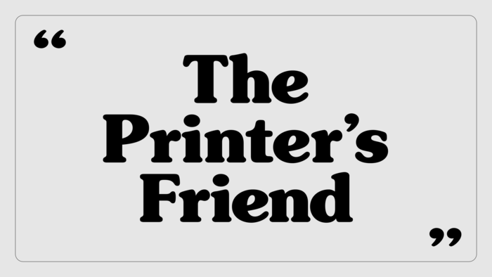
This is such a classic retro font that’s also versatile. Something like ITC Souvenir could work for so many products and bring instant nostalgia to the project.
Browse 250,000+ fonts from more than 2000 type foundries.
Available now on Monotype Fonts.